A natural transition, and freeing!
Most teams that I have worked with were short of resources, and as the sole User Experience Designer, I was also the de facto visual designer. Most of my work has been for browser-accessed applications, and the flexibility of the presentation layer offers many more visual design options than client-side applications. What I found freeing was less worry about image resolution than with print, and the immediacy of the results.Header Design
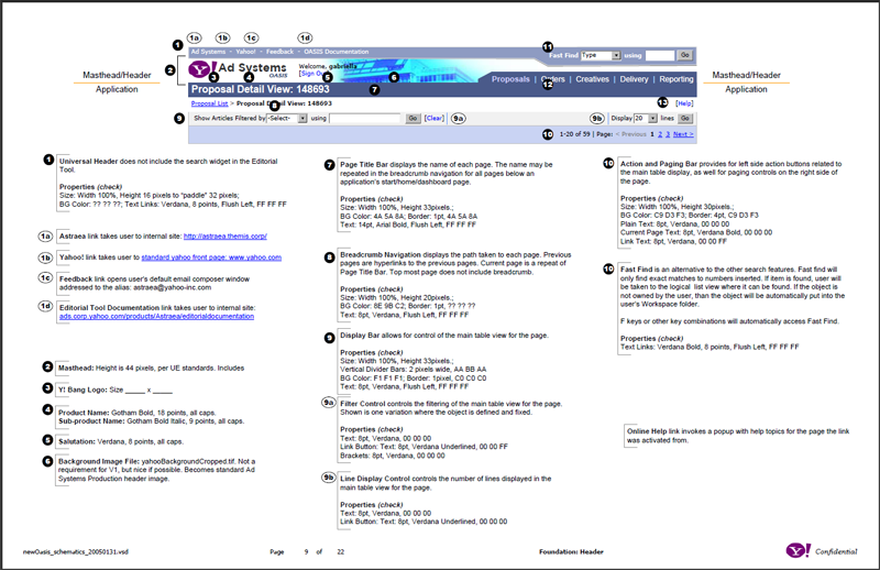
While part of Yahoo! Ad Systems, I supported multiple product teams. The look and feel of the different tools was overwhelming and visually confusing for users. As more products and tools were being created and revised every month, a new, consistent look and feel were necessary. I designed the header based on the current Yahoo! consumer page standards and modified it where appropriate for the enterprise world. My goal was to design a clear and simple header that was attractive but did not distract.
Logo
Having used the Egyptian Eye of Horus since the company's inception, BizGenics’ management felt that the original logo was out of sync with the changing strategic focus. Updated branding was important to support evolving marketing efforts and a new strategic vision. After a review of competitive branding and trends in other verticals, I decided on a simple logotype. Besides looking at different fonts, I wanted to include a visual representation of the company’s technology of predictive analytics. Adding the arrow starting and ending at the "I" connoted the cycle of information retrieval and organizational feedback.
The logo presentation was attended by the whole company, about 12 people at the time. That required a presentation capable of reaching a wide range of experience with design. Some individuals had a history of working with designers and branding, while others only had a background in engineering or data. I wanted to make sure everybody felt heard and that their opinion would be considered by me, the executives, and sales.