Data visualizations are a pillar of data driven applications.
Outside the corporate meeting room, data visuals are attractive and help a viewer to more easily understand a data set. In business and not-for-profit organizations, data visuals can also enable quick comprehension of context, and interactive data visualizations can enable workflow efficiency. One control can affect change on multiple metrics.
A disappointment in my early career was the number of big software companies that relied on tables without options for presenting the data as a chart or graph. Of course, things have improved over time, and data visualizations have become more available and have better usability.
Data graphics reduce the cognitive overhead required to create a mental model from data sets. I believe that reducing cognitive overhead for any task can help reduce fatigue and errors.
Advanced visualizations are critical for context and workflow efficiency.
I have been fortunate to have worked for two companies that understood the importance of data visualizations. Sometimes the need was for search and selection, while other times it was for workflow management. In all cases the use of an advanced visualization obviated the need to use Excel. The use of applications external to the main tool used by an organization can be time-consuming and a distraction. Yahoo! Advertising Systems techs had to use seven internal tools, plus email, a spreadsheet, notepad, a word processor, screen captures, and a web browser; all at the same time! So every application that could be folded into the main application was a significant reduction in cognitive overhead and screen clutter.
Progressive Disclosure
End-of-year compensation discussions start with the rating of employees using multiple criteria, which results in one or more scoring values. Managers and executives generally rely on several spreadsheets to display the data that will be used to negotiate final compensation. SuccessFactors was exploring ways that visuals could improve the tedious and stressful process of understanding the data, and then the face-to-face negotiations to decide on compensation. The compensation process is a significant pain point for customer organizations.
I was called into a meeting with executives from Marketing and Sales. They explained their problem statement and then what they wanted to accomplish. I started quick sketches using Visio right in the meeting. Working this way allowed them to see how the requirements could be turned into a visual interface, which enabled several rounds of revisions.
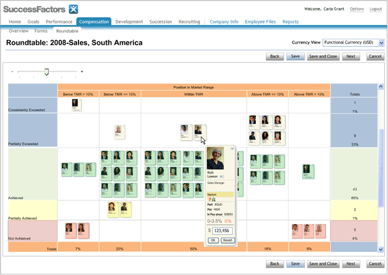
Schematics of my design show how tabular data can be displayed as a rich graphical experience, and how a slider can control the size and details of data points. The graph presents data dimensions on all four sides: the left side shows performance categories; the top shows the talent market rate (TMR) relative to industry statistics; the left side shows distribution within the selected employees; and the bottom shows the percentage of employees within the vertical TMR distribution. Additional meaning is added with color coding.
In this example, employees in the upper left corner are employees who consistently exceed expectations and are undercompensated relative to the industry distribution, while employees in the lower right are underperformers who are overcompensated.


Graphic tooltip on hover (L). How the solution was developed (R).

One Control Affecting Multiple Views.
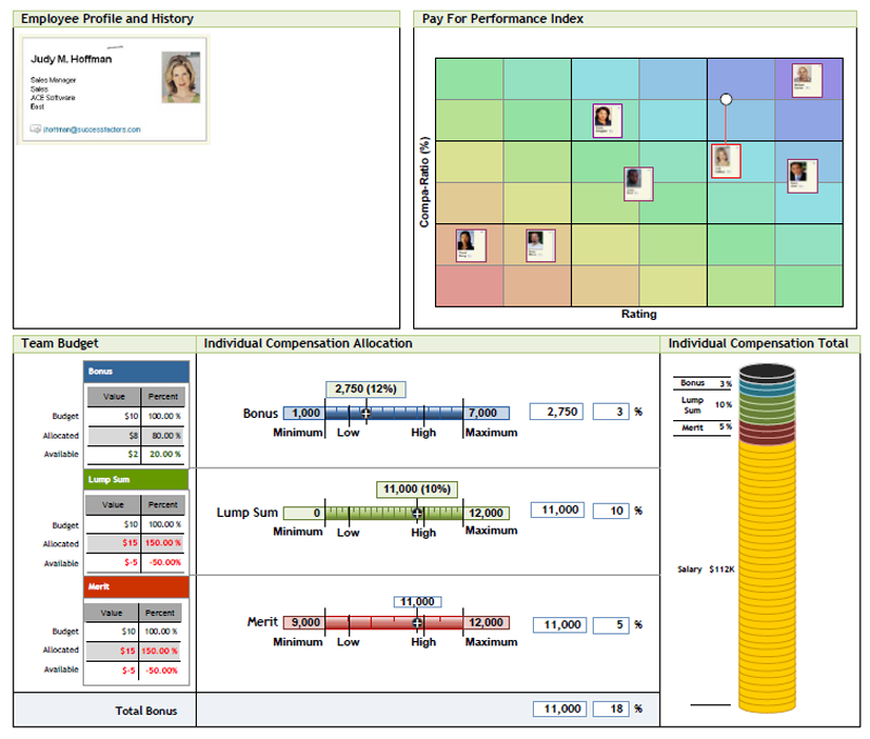
Another aspect of performance compensation that I worked on was how the different types of compensation can make up a package, and how one employee’s package relates to other employees.
In this concept, the main controls are the three sliders. Each slider controls the amount awarded to the employee and shows the max and min set points. The user can either use the sliders, or fill in a dollar amount with the keyboard, or enter the type’s value as a percentage of the individual's compensation total. The values affect three displays: a graphical representation of the total compensation package, values for the team’s budget, which are totals of all awards for the employees team, and the employee's package relative to others on the team.
The top right display shows the Pay For Performance Index, which shows both the employees performance score relative to other employees, and shows how the employee’s package compares to others. The comparison to other employees is called the compe-ratio, which is important to ensure that compensation matches the individual’s performance rating, and, is appropriate compared to other individuals' ratings and compensation.