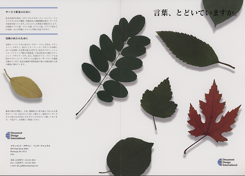
Brochures for Japanese and Korean consumer electronics executives.
A marketingBrochure for the Japanese consumer electronics Market, the goal was to highlight the company's capabilities while creating a cultured and refined look. well brightly colored brochures with cartoon characters were very popular at the time it was felt that this look was more in line with the company's branding. The green leaves were intentionally vague and without detail, while the red and yellow leaves were details. The goal was to show that the company was different from the competition.
 |